And now the DJIA ....
 Above you'll see a 6 month chart for the Dow Jones industrial Average, the chart has the same components as the S&P500 chart. One notable exception is the orange line indicating a support line. You can see that prior to February this line acted as resistance; this is not uncommon.
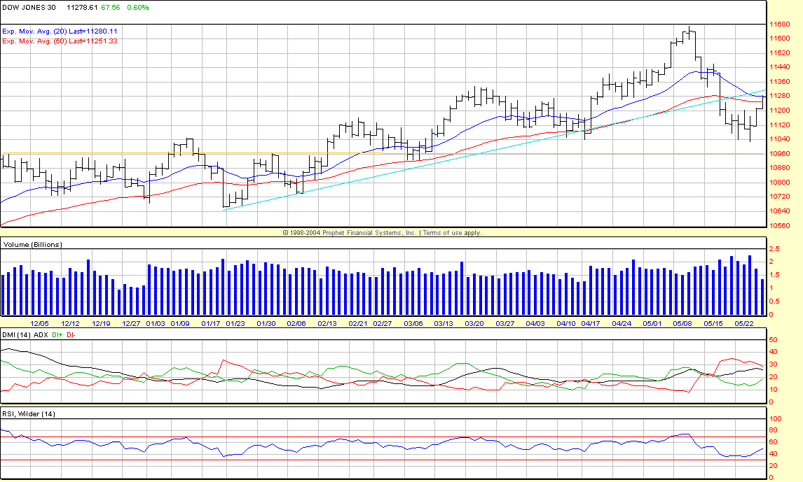
The end of this chart (showing market close on Friday May 26th), shows a brief up-trend just like the S&P500. In the case of the DJIA this up-trend reached it's 20 EMA; however, just like the S&P500 it did so on comparatively low volume. This is not surprising as the DJIA and he S&P500 have high correlation. The outlook is similar to the S&P500, since the latest trend reached the EMA on low volume we'll have to see if the DJIA moves back into the trend channel or continues to fall, the trading volume is again an important indicator of the strength of these possible moves.
Why should I care?
Per my "game plan" I'll be looking for entry and exit points for the 30 stocks that make up the DJIA. Discerning the general trend of the overall average helps indicate where the underlying stocks may be heading. In this case if the indications are not clear the stock in the DJIA will most likely trend "sideways" or down in the short-term.
Next week prediction: DJIA will revert to a slight down-trend. The previous down-turn was related to people turning to other investments on the news of rising interest rates. Despite the up-turn (on weak volume) there will continue to be downward pressure as "slower" investors shuffle where they put their money.
Next up, getting back on schedule with Money Management ...
posted by Jeremy at 3:45 PM
![]()
![]()


0 Comments:
Post a Comment
<< Home